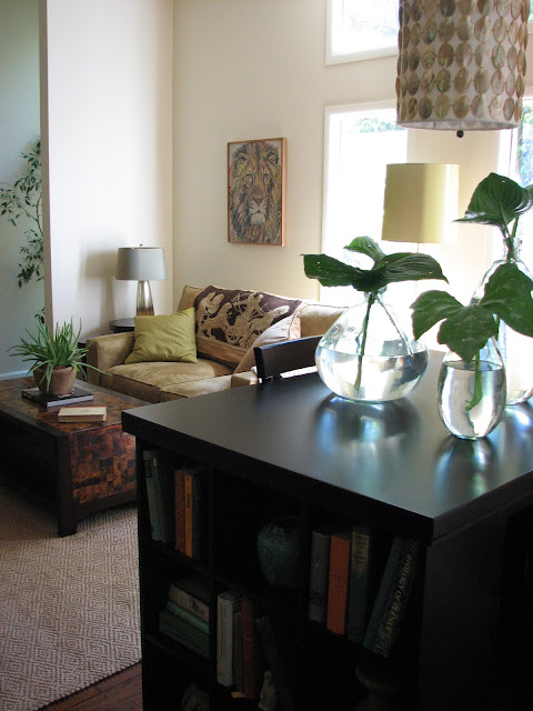
My clients, the Hart family wanted a living room that they could really live in. Like I mentioned in my previous post on their dining room, they're an active family who love being outside, hiking, camping and spending time together so we really wanted an outdoors-in natural, fresh feel in here. They're also musically-inclined and wanted a place where the damily could practice playing. Although they do entertain, the initial function of their living room was to be a place where they can hang out, pay bills, do homework, play instruments and relax.
Here's what the space looked like before. It was a totally empty blank slate (how fun?!):
And here's it is now:
When I initially surveyed the house, I noticed they didn't have many family photos and suggested doing a family photo wall in the living room because they wanted an extremely personal family-focused feel in here. The problem was that they didn't have many family photos to create the wall.
...So, this past Fall, I met with the family for a family "photo shoot" and I took a ton of pictures of them in the backyard. We had so much fun "playing" in the leaves and even Whimsy, the family dog, got her close-ups.
{The Harts}
They came out really well and I created this photo collage of all of the photos surrounding a natural "twiggy" sconce:
Mike & Debbi pay their bills and the kids also do on homework here at the worktable:
{I love their family-passed-down-clock !!}
We chose a pen shell cocktail table: (This was the first element I chose for the space and used it as a springboard for the rest of the design)
And repeated the natural shells again in the capiz shell pendant over the work table:
I found this cool old lion painting in their garage. I think he's prefect for the space and it was the last thing to go up.
I tossed this cool needlepoint throw of mine over the back of the loveseat for some added interest:
{It's a very tone-on-tone textural design in keeping with the family's natural, relaxed style}
The kids & I picked some pretty polar leaves from the trees outside the house and I had them enlarged on 3 and a half feet high canvases for the walls. I thought it was a really personal way to "bring the outside in" since they love their house because of its wooded location.
Here's a view of the second poplar leaf canvas:
Anyway, I hope you enjoyed the before & after and thank you again to the Harts for trusting me to design your home! It was so much fun!!
Hope you had a great 4th of July weekend and if you missed the first part of this project (the dining room), check out the previous post here.


0 comments:
Post a Comment