BUT... because my mind's
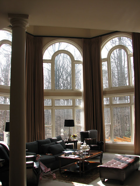
So, without further ado, I want to share some before pictures of a project I've been working on for a while. My client's name is Ira and she has two beautiful little girls & a husband. They entertain a lot with other families and want their family room (below) to seat more people, be stylish yet comfortable, and feel young and happy (like them!). Here it is when I first visited, 'before':
It's a massive family-friendly space with a huge TV in a nook next to the fireplace. They hang out in here every day. Ira has an amazing sense of style & taste but felt her home was lacking something. It was beautiful and a bit serious and wasn't as personal as she wanted it to be. Ira tends to like primarly cool colors with a hit of warmth injected. I'd describe her style as "sophistcated pretty..." She likes an elegant mix of classic and modern with a youthful edge. When she has something to show me that she likes, I know it's going to be beautiful.
Part of what makes design so rewarding is helping people figure out their own personal style and helping them translate it into their homes. Everyone has her own unique style and I love looking at rooms and making decisions through my clients' eyes... it's almost like putting on a pair of colored glasses because once you learn who your client is design-wise, you need to put on their "glasses" when designing. Of course, it's still your eyes looking through the glasses so you never lose sight of your aesthetic and beliefs and knowledge, but you do see things differently than you would for yourself.
Anyway, the family room is open to the kitchen. Below is a photo of Ira's kitchen before:
{Before-- LOVE the fixture!}
Ira wanted to lighten it up & cool it down. She chose a warm white/ cream and you can see the newly installed cabinetry:
{Mid-project/ Now}
We're going with a pale gray-blue on the walls in both the kitchen and family room.
{Mid Project/ Now}
We've chosen these beautiful glass mosaic tiles for the backsplash and are running them up the entire wall over the sink/ around the windows:
Here's the chandelier for over the table:
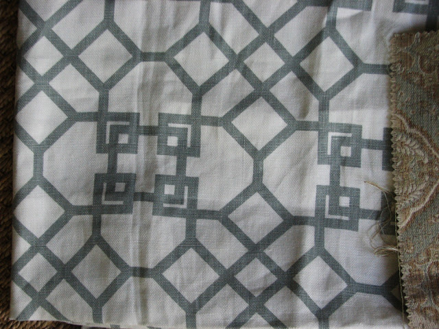
Here's a quick pic of some of the fabrics we're using in the family room:
I love them all!! The warm kind of camel-golden fabric towards the top-left is an existing sofa Ira has in the basement that we're moving upstairs. We're using Windsor's Smith's white & blue-gray linen on the curtains and this on the custom English arm sofa:
At the base of the sofa, we're having nailheads placed to outline the curvey design of the fabric. We're also doing two tufted wingchairs in a blue-gray mohaire velvet (swoon!!!) and I found this cool vintage sunburst table for the coffee table:
I love its distression and warmth. It will be really beautiful with the gold tones of the existing sofa.
Here's the existing sofa fabric and the ottoman fabric:
Here'a c lose-up of the Windsor Smith fabric I'm in love with:
And one last photo of an embroidered linen for a pillow on the existing sofa:
There's so much more to share with you & I'll keep you updated along the way. The hardwood floors have been installed and it's soon to be painted.


0 comments:
Post a Comment