I am Canadian...Happy Canada Day!!

Although I began my life far across the ocean in Northern Ireland - and I am Irish, first and foremost - I definitely identify as a proud Canadian. I love that my country is a wide expanse of terrain that changes dramatically as you travel from east to west. Rich culture, diverse cities, prairies, staggering mountains, two oceans, the Niagara Falls, and the northern territories...a trip across the country is one I plan to take someday, and I look forward to acquainting myself with the beauty and wonder of this country I call home.

It may seem smug, but I think we can lay claim to some of the most talented singers (Celine Dion, Shania Twain, Bryan Adams, Nickelback, etc.), comedians (John Candy, Dan Aykroyd, Jim Carrey, Mike Myers) and designers (Debbie Travis, Candace Olsen, Sarah Richardson, Karim Rashid, Patricia Gray and more!) in the world. Like I said, I am proud to be Canadian, and when I sing our national anthem, I feel such a rush of that pride.


Canada Day, for us, always means fireworks, a parade, a few tattoos, outdoor games and a barbecue with all of the trimmings (thanks to well-organized and generous friends!). While the boys have outgrown their tolerance for donning a matching red, Canada Day t-shirt, Sophie is still game and wears the maple leaf with pride!
To my fellow Canadians - and as those of you south of the border head into your own Fourth of July celebrations - celebrate and enjoy what your country means to you. Fire up your barbecue and submit to a (temporary) patriotic tattoo or two. Fly those flags high and take a moment to reflect on what your country means to you.

Happy Canada Day, one and all!!

Take a Bow Tuesday


I don't mind saying I am struggling with this commitment thing. I am not a blogger who does well with an organized posting schedule. True to my nature, I am a bit of a fly-by-the-seat -of-my-pants kind of blogger. When a thought or post idea pops into my head, I start writing. Still, I am bound and determined to stick with my Tuesday feature of honouring my talented blogging friends.


And here is this week's edition:
Now, please go and visit these bloggers and enjoy the view!!
***************************************
Stay tuned till later in the week, when I announce some very exciting news. I'd love to hear any guesses...and no, there is absolutely no baby involved!!

I'm So Excited!!!!

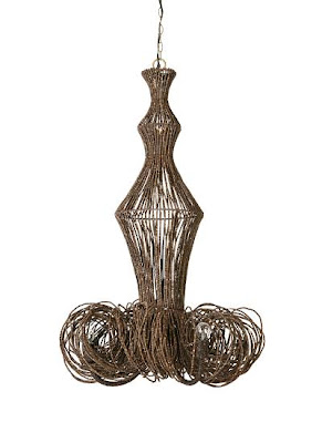
I just ordered our new dining room chandelier!!! It's made from coconut beads and is half off at Anthropologie. It reminds me a bit of Nina Griscom's ($5000) branchelier:


Obviously that's a bit out of our price range... ;) When my friends gave me a gift card for my birthday, I found the coco-bead chandlier & was in love. To be honest, few people in my "real life" seem to like this chandelier, but I was hoping you design divas would "get it." ;) ;) hahaha

Anyway, I'll be posting pics when it arrives!!

xoxo,

lauren

Tips for Taking Interior Photographs (non-technical!!)

I received a bunch of emails after my last post asking about tips for taking "after" pics of rooms, so I thought I'd share some that I've discovered over the years. (I am by NO MEANS a professional as you can tell though!! ) Since so many of us are obsessed with getting our houses looking pretty & have blogs, I figured it couldn't hurt! A lot of these might sound like no-brainers, but I really had no clue about them when I started.

1) Don't use flash. Here are a some of 'before and after' pics of our old house, where we moved just after the apartment, the townhouse. I took them when we first moved in, but some of the 'afters' are from a year or 2 later. Here are a couple of "flash" photos:

Images with flash end up being dark & cold & cheap-looking. (above & below)
Now, check out the "after" (below). It's light & airy and much better:
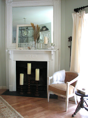
2) Shoot during the day when the lighting is good. (Unless you're specifically after nighttime shots like a Christmas tree at night or candles or something special like a city view.) Here is our living room when we first moved in. (With all of my lovely decor from my old apartment... eeeeeek) I didn't use flash on it even though it was taken at night: (which is good)

But check out the difference in the same room during the day: (no flash of course)
3) This one really should have been a no-brainer for me (but it wasn't!)... You should "style" the space. (ok, #1 clear out clutter... I think in the pic below that I must've just been trying to get a shot of the pretty roses from my husband -- not trying to get a room shot--- but it does illustrate this point perfectly. How can you even notice the flowers when there's junk everywhere?!)

How much prettier do these (below) look? No clutter, no flash... HUGE difference:

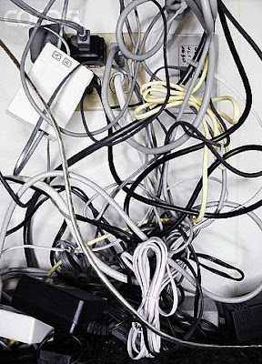
Some reminders for styling: ditch items like wastebaskets, newspapers... Hide your electrical cords. Tape them to the underside & down the back legs of furniture so you can't see them. Nothing is worse than a tangle of cords.

Styling for the kitchen: Sometimes people actually go too sterile when photographing kitchens. But, remember you can ditch items like your toaster (if it's not cute & takes up too much space), sponges, pot scrubbers, pens & pencils, etc. Consider having a pretty soap dish or dispenser, nice towels, good-looking cooking utensil holder, a bowl of fruit and/ or vase of flowers.


The pictures above & below are from when we sold our house so actually a few things are missing because staging is different from decorating (like the pretty towels & a few things that might warm it up) but we did set up a couple of bottes of Aquafina on the bar, which I always think looks nice. (I love Aquafina bottles & totally refill them with fresh water & stick them back in the fridge!!)

Styling for the Bedroom: Again, some fresh flowers or something pretty on the nightstands. (Even set up some colorful jewelry or books--- anything that's pretty & adds a little something)... Add interest to bedding. Think of Pottery barn and all their layers. Even just a throw at the end of the bed can do the trick.

Show personal, but not-too-personal-items that make the space look lived in: NOT the box of tissues but maybe a cool glass of water in a vintage glass or a pair of glasses on a stack of pretty books..


For living rooms, a lot of the same things apply. Use pretty pillows and interesting accessories. Get rid of any clutter that isn't attractive. Always add fresh flowers or greenery if you have time. You'd be surprised what a huge difference adding flowers/ greenery into the room does. Again, the goal is to make the space look "lived-in" but not cluttered.

Pottery Barn is awesome at styling in my opinion. I might not always be in love with what they're selling but I'm always so impressed with their styling. (above) For dining rooms, make sure there's something beautiful on the table. It doesn't necessarily have to be a set table (which does look gorgeous) but it could be something simple like a pair of lanterns or dinnerware stacked up as if it's about to be set with a little vase of fresh flowers.


Take advantage of tabletops & shelves. Every surface is a change to create something beautiful. It's important to train your eye. Scour catalogs & design magazines & notice all the details that are present & missing. You'll be surprised by how much you can learn & by how good you'll get.


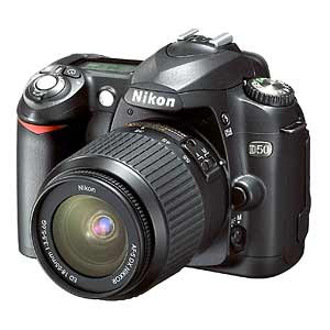
4) Use a tripod or hard surface to set the camera on. I'm really guilty of not following this rule and it shows. This is huge because if you're not using flash, it's really easy for the photo to blur and any movement at all messes the photo up. (Virtually none of the photos I take myself are clear enough, probably because if this!! ok, I know what I need to go buy!!)

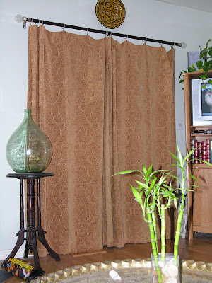
5) Leave out any unattractive features in the room from the shot... Depending upon the look/ mood you're going for, this could be anything from the TV, to speakers, to the chair that you just haven't had the time/ money to reupholster yet.


6) Shoot from lots of different angles & take TONS of pics. I'm not a professional photographer so I don't know which angle a shot will look best from so I take them all. This way, I get tons of photos of one room & I have my pick of which shot works best. I'm often surprised that the one I thought would work the best, doesn't. Get low, get high, go straight on... try it all. (You'll eventually get the hang of what usually works best & won't have to always take so many shots but it's good to start out this way to find out what you like. )

7) Figure out the style of photography you like & try to emulate it. There is a HUGE difference between Architectural Digest & Domino. I made the (HUGE!!!) mistake of spending $$$$s on a photographer who did work for Architectural Digest to shoot for my portfolio. His work was amazing, but totally not my style. The photos ended up looking static & serious to me, which was not how I wanted my work coming across at all. The angles were all straight on & I couldn't feel any movement in the room. I was able to use a few shots that I loved, but overall for the amount of money I spent, I was really disappointed. (They're all on my website now & it drives me CRAZY!!! arg!!) But the point is, it was my fault. I didn't have enough knowledge of the style of photography I wanted. If you can figure out what you like, you can immitate it. (country living image below)


So, there you have some info on how to get better interior shots. I know I didn't address any technical issues & that would be because I'm still clueless in that arena!!! (I have yet to read my camera's manual so that might help a bit!) Hope everyone had a great weekend!!!
xoxo,


lauren

Tips for Taking Interior Photographs (non-technical!!)

I received a bunch of emails after my last post asking about tips for taking "after" pics of rooms, so I thought I'd share some that I've discovered over the years. (I am by NO MEANS a professional as you can tell though!! ) Since so many of us are obsessed with getting our houses looking pretty & have blogs, I figured it couldn't hurt! A lot of these might sound like no-brainers, but I really had no clue about them when I started.

1) Don't use flash. Here are a some of 'before and after' pics of our old house, where we moved just after the apartment, the townhouse. I took them when we first moved in, but some of the 'afters' are from a year or 2 later. Here are a couple of "flash" photos:

Images with flash end up being dark & cold & cheap-looking. (above & below)
Now, check out the "after" (below). It's light & airy and much better:

2) Shoot during the day when the lighting is good. (Unless you're specifically after nighttime shots like a Christmas tree at night or candles or something special like a city view.) Here is our living room when we first moved in. (With all of my lovely decor from my old apartment... eeeeeek) I didn't use flash on it even though it was taken at night: (which is good)

But check out the difference in the same room during the day: (no flash of course)
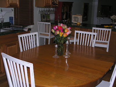
3) This one really should have been a no-brainer for me (but it wasn't!)... You should "style" the space. (ok, #1 clear out clutter... I think in the pic below that I must've just been trying to get a shot of the pretty roses from my husband -- not trying to get a room shot--- but it does illustrate this point perfectly. How can you even notice the flowers when there's junk everywhere?!)

How much prettier do these (below) look? No clutter, no flash... HUGE difference:

Some reminders for styling: ditch items like wastebaskets, newspapers... Hide your electrical cords. Tape them to the underside & down the back legs of furniture so you can't see them. Nothing is worse than a tangle of cords.

Styling for the kitchen: Sometimes people actually go too sterile when photographing kitchens. But, remember you can ditch items like your toaster (if it's not cute & takes up too much space), sponges, pot scrubbers, pens & pencils, etc. Consider having a pretty soap dish or dispenser, nice towels, good-looking cooking utensil holder, a bowl of fruit and/ or vase of flowers.

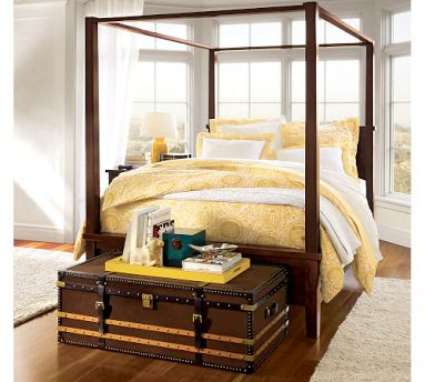
The pictures above & below are from when we sold our house so actually a few things are missing because staging is different from decorating (like the pretty towels & a few things that might warm it up) but we did set up a couple of bottes of Aquafina on the bar, which I always think looks nice. (I love Aquafina bottles & totally refill them with fresh water & stick them back in the fridge!!)

Styling for the Bedroom: Again, some fresh flowers or something pretty on the nightstands. (Even set up some colorful jewelry or books--- anything that's pretty & adds a little something)... Add interest to bedding. Think of Pottery barn and all their layers. Even just a throw at the end of the bed can do the trick.

Show personal, but not-too-personal-items that make the space look lived in: NOT the box of tissues but maybe a cool glass of water in a vintage glass or a pair of glasses on a stack of pretty books..


For living rooms, a lot of the same things apply. Use pretty pillows and interesting accessories. Get rid of any clutter that isn't attractive. Always add fresh flowers or greenery if you have time. You'd be surprised what a huge difference adding flowers/ greenery into the room does. Again, the goal is to make the space look "lived-in" but not cluttered.

Pottery Barn is awesome at styling in my opinion. I might not always be in love with what they're selling but I'm always so impressed with their styling. (above) For dining rooms, make sure there's something beautiful on the table. It doesn't necessarily have to be a set table (which does look gorgeous) but it could be something simple like a pair of lanterns or dinnerware stacked up as if it's about to be set with a little vase of fresh flowers.


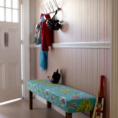
Take advantage of tabletops & shelves. Every surface is a change to create something beautiful. It's important to train your eye. Scour catalogs & design magazines & notice all the details that are present & missing. You'll be surprised by how much you can learn & by how good you'll get.


4) Use a tripod or hard surface to set the camera on. I'm really guilty of not following this rule and it shows. This is huge because if you're not using flash, it's really easy for the photo to blur and any movement at all messes the photo up. (Virtually none of the photos I take myself are clear enough, probably because if this!! ok, I know what I need to go buy!!)

5) Leave out any unattractive features in the room from the shot... Depending upon the look/ mood you're going for, this could be anything from the TV, to speakers, to the chair that you just haven't had the time/ money to reupholster yet.


6) Shoot from lots of different angles & take TONS of pics. I'm not a professional photographer so I don't know which angle a shot will look best from so I take them all. This way, I get tons of photos of one room & I have my pick of which shot works best. I'm often surprised that the one I thought would work the best, doesn't. Get low, get high, go straight on... try it all. (You'll eventually get the hang of what usually works best & won't have to always take so many shots but it's good to start out this way to find out what you like. )

7) Figure out the style of photography you like & try to emulate it. There is a HUGE difference between Architectural Digest & Domino. I made the (HUGE!!!) mistake of spending $$$$s on a photographer who did work for Architectural Digest to shoot for my portfolio. His work was amazing, but totally not my style. The photos ended up looking static & serious to me, which was not how I wanted my work coming across at all. The angles were all straight on & I couldn't feel any movement in the room. I was able to use a few shots that I loved, but overall for the amount of money I spent, I was really disappointed. (They're all on my website now & it drives me CRAZY!!! arg!!) But the point is, it was my fault. I didn't have enough knowledge of the style of photography I wanted. If you can figure out what you like, you can immitate it. (country living image below)


So, there you have some info on how to get better interior shots. I know I didn't address any technical issues & that would be because I'm still clueless in that arena!!! (I have yet to read my camera's manual so that might help a bit!) Hope everyone had a great weekend!!!
xoxo,


lauren

Just Passing Through...


While many of us focus our energy (and budget) on decorating the major living spaces of our homes, how many of us actually focus any attention on the hallways, corridors and foyers of our homes?Indeed, few of us are lucky enough to have large hallways that can be adorned with artwork on the walls and where children run carefree for more than a few feet. Still, the hallowed halls of our homes are the perfect spot for the following accessories and/or details:

Family photos
Collections, on shelves, in shadow boxes, or simply hung on the walls

A beautiful clock, to be glanced at as we hurry about our day

A gallery of our children's artwork, either framed or clipped causally onto dollar store clip boards

A great mirror to sneak a peak at our frazzled reflections as we rush out the door

A smart, stylish rug

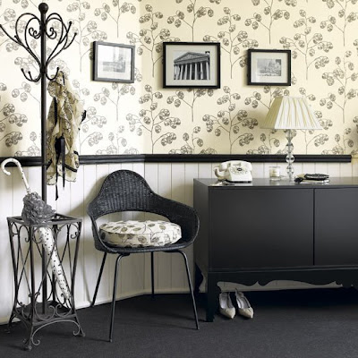
Wallpaper, for those hesitant to "try it again for the first time" anywhere else:


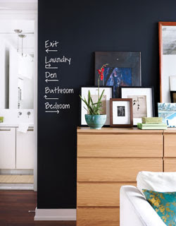
A chalkboard wall, for those gutsier homeowners:
(photo: Wish magazine)


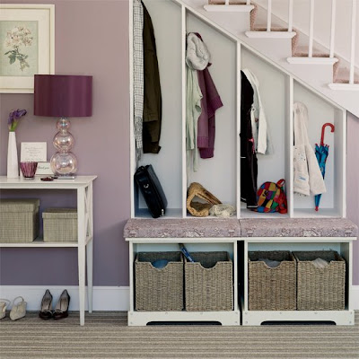
functional built-ins:


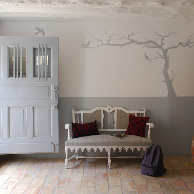
A mural, or other fun wall treatment (like this decal):


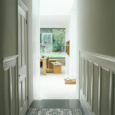
Architectural detailing, like this panel moulding:

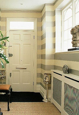
Walls painted in bold, snappy stripes:

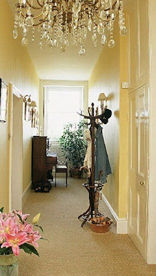
Or kept simple but highlighted by a fabulous lighting fixture:

So, as you walk down your hallway, don't just pass on by a great opportunity to decorate the passageways of your home. Look at them differently.

Because, as we all know, sometimes the journey can be so much better than the destination...

*****************************

(all photos, unless otherwise noted, from House to Home UK)